3.- FONTS
Fonts are very important since most of the time your game uses
dialogues, and creating different fonts for each character makes the game feel
much better
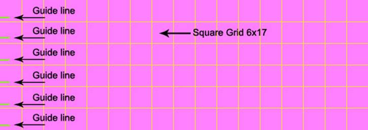
.- Make a grid 6x17 square spaces, add a 1 or 2 pixel tall by 8 pixels wide
line (or around 5mm long) (something similar to this __ ) this represents the
line guide for the text in the first 6 squares of the left side and its needed.
(each line should be like the
beginning of the guide line) I made this line to go out the left side of the
image to work as a ruler.
Then placed each font on every square
Take note that each letter should match the description
you write for the alphabet (font settings)
A
couple of very important things to be aware of when making fonts.
![]() .-Each font you
draw must be a solid representation
of the symbol. I mean, i had problems with fonts
because my " was represented by two individual lines, but the engine saw
them as independent lines like this ' ' , so the text had the wrong image attached to it because of
this.
.-Each font you
draw must be a solid representation
of the symbol. I mean, i had problems with fonts
because my " was represented by two individual lines, but the engine saw
them as independent lines like this ' ' , so the text had the wrong image attached to it because of
this.
![]() You can use
dots over an i or a j letter or double points like : or the = sign since reading them from
left to right the engine will see only one object, but a " will be read
from left to right as two distinct objects like this ' '
You can use
dots over an i or a j letter or double points like : or the = sign since reading them from
left to right the engine will see only one object, but a " will be read
from left to right as two distinct objects like this ' '
![]() .- ALSO Be VERY
aware on dust or problems between your letters. If you reorganize your letters
you probably get a pixel or two left behind, this will cause the engine to
identify the pixels as a letter, even a line on the far right of the image will
represent a letter, and this causes problems.
.- ALSO Be VERY
aware on dust or problems between your letters. If you reorganize your letters
you probably get a pixel or two left behind, this will cause the engine to
identify the pixels as a letter, even a line on the far right of the image will
represent a letter, and this causes problems.
![]() .-Use a 2x8
pixels horizontal line for your guide lines, DONT use
the representation of your underline font for this.
.-Use a 2x8
pixels horizontal line for your guide lines, DONT use
the representation of your underline font for this.
I had problems with the downloadable fonts in the download
section because the guide lines where margins of the font.
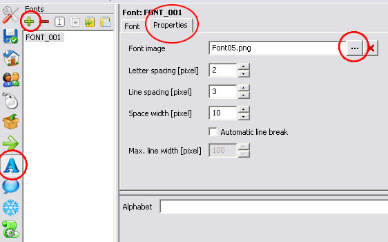
Now, To make
them work in your game now you create![]() new fonts in the FONT
new fonts in the FONT ![]() panel, rename them
panel, rename them ![]() depending on where you
are going to use them.
depending on where you
are going to use them.
Then go into PROPERTIES and
load the Font image you are going to use.
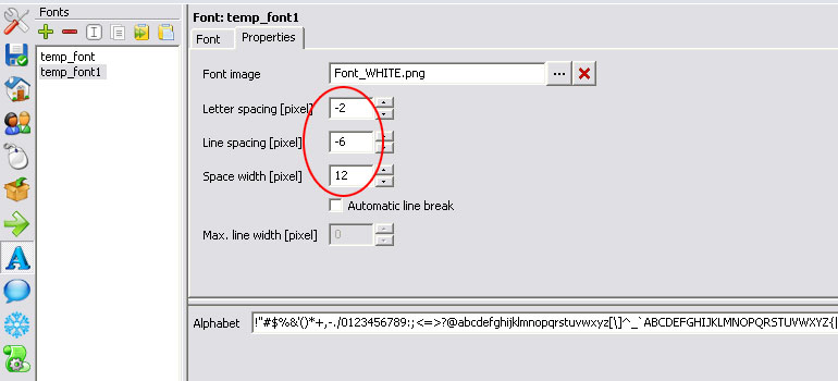
If you want the letters to display a bit more compact, you can use
negative numbers in the letter and line spacing tabs like in the following
example.
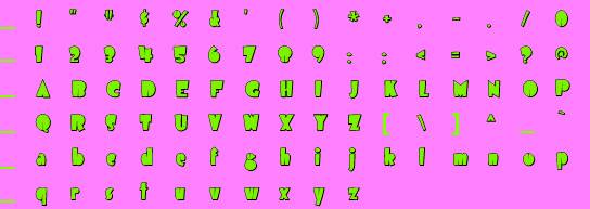
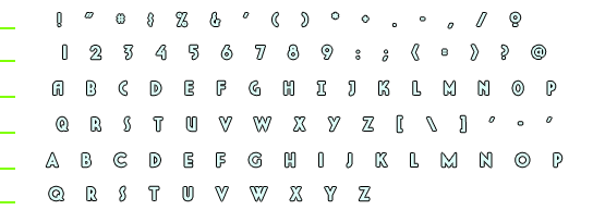
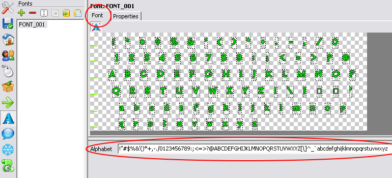
Depending on how you created your font image you are going to create the
alphabet for it.
Take a look at the image bellow and the alphabet description; you should
see they both match.
Use this description in the "alphabet" tab:
!"#$%&'()*+,-./0123456789:;<=>?@ABCDEFGHIJKLMNOPQRSTUVWXYZ[\]^_`abcdefghijklmnopqrstuvwxyz
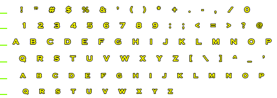
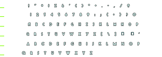
Also note how Visionaire understood the font
image and created a box for each unique font and also notice how the green
guide lines were not included.
I made these fonts to share them with the visionaire comunity; if you want to make your own fonts you can use these as template.
If you Do use my fonts in your games the
only thing I ask of you is to give me credit for their creation.